


Let’s make a fun Christmas-themed .NET MAUI app UI!
Happy Holidays! 🎄✨
The Christmas season is a special time to enjoy with our loved ones, full of health, love and joy. As we celebrate, it’s also an opportunity to keep our skills sharp and continue learning practices that will benefit us all in the new year.
In this article, we’ll take on a fun challenge: Replicating a Christmas UI inspired by a Dribbble design. 🎨 We will explore native .NET MAUI controls and even incorporate some from the Progress Telerik UI for .NET MAUI library in a super easy and fast way! 🚀
Before diving into the code, here’s a piece of advice I always give: Take a moment to analyze the task at hand. Thoroughly understanding the challenge will help you identify the best approaches, saving time and effort during development.
Now, let’s get started!
Breaking Down the Original Design into Blocks
Our first step will be to analyze the user interface we are going to replicate. The design consists of three screens, each divided into one or more steps that are numbered and highlighted with different colors to make them easier to identify.
We will explain each one of these steps along with the corresponding code snippets. Now, let’s take a look at the structural division in the following image:
Now that we know the order in which to start coding, let’s dive in! 😎
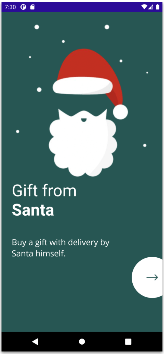
Step 1: Intro
Step one includes all the elements that complement the Intro page, basically it is an image, with a rounded button and two texts. All the code we’ll add here will be placed in a file called IntroPage.xaml.cs.
Start with the Main Layout
To begin, it’s necessary to select a main layout, which will contain all the UI components. In this case, due to the flexibility it provides for replicating this UI, as well as its performance, we’ll select the Grid layout.
Set the BackgroundColor of the ContentPage to #275653. (This is the greenish color you see on the first page.) For the main layout, we’ll use a Grid divided into three rows, with a RowSpacing of 40 to provide better separation between them.
<Grid RowDefinitions="*,Auto,*" VerticalOptions="Center" Padding="25" RowSpacing="40">

Grid>
Santa Claus Image and Labels
Next, we’ll add an image of Santa Claus along with two additional text labels.
<-- Add the next code block here -→
⚠️ Note that for the “Gift from Santa” text, we used FormattedText. I chose this approach to show you an optimal and different way of creating the same label with multiple styles! I also used
Circle Button
To finish this first step, we’ll add a circular button positioned on the right side, with only a part of it visible. There are two key points to consider here:
-
Achieving the circular shape: Just set both the
HeightRequestandWidthRequestproperties to the same value, then set theCornerRadiusproperty to half of that value. (For example, set theHeightRequestandWidthRequestto 100, and theCornerRadiusto 50.) This will give you a perfectly circular button! -
Creating the illusion that the button is split in half: This is easily done by adjusting the margins. Set
Margin="0,50,-50,0"where the-50margin on the right side hides part of the button, giving the appearance that it’s only halfway visible.
In code, it will look like this:
The result of our first step will look like this:

✍️ For Steps 2 and 3, let’s create a file named GiftListPage.xaml.cs.
Centered Text and Icons
For the header block, we’ll start by adding the components required by our UI: the hamburger menu icon on the left, the main text in the center and the cart icon on the right.
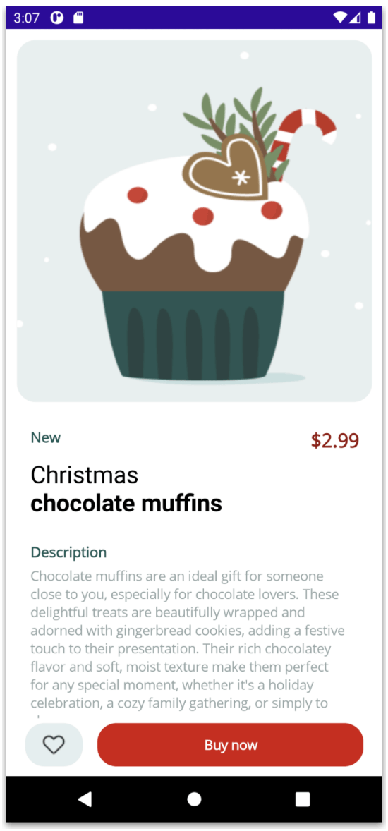
Next, add the image with rounded borders from Step 4. To round the edges, we’ll use the Borders control, just like in the previous steps.
The visuals result of our step will look like this:


Step 5: Detailed Descriptions
Let’s move on by adding the elements for the “New” title, the product name and the price, structured as follows:
Description and Text
Floating Buttons
Finally, we’ve reached the floating buttons! Now that we have a well-designed structure in place, navigate to the grid section where it says:
✨ And voilà! 🎉 Your screen should now look like the one shown below:

Wrapping Up
That’s it! 🤩 In just a few simple and quick steps, you now have three complete screens for an app in .NET MAUI, using a mix of native elements and Telerik controls! I hope this article has been incredibly helpful and adds value to your development journey. 🚀
Get Started with UI for .NET MAUI
Thanks for reading this article! 💚💕 See you next time! 🙋♀️


