
Learn several useful properties to help you customize and enhance your buttons in .NET MAUI, like rounding the corners buttons and enabling automatic scaling.
Buttons are one of the most important visual elements in any application. Through them, users can perform key actions that move the app’s flow forward, like navigating to another page or calling an API. That’s why it’s essential to understand their different properties.
There are several interesting properties that you might not even know are available for the Button in .NET MAUI, but learning about them will help you create more precise and visually appealing designs.
In this article, you’ll discover six of those properties, understand how they work and see how to implement them. But before diving into each one, let’s take a quick preview of what’s coming. 🚀
- TextTransform
- FontAutoScalingEnabled
- CharacterSpacing
- CornerRadius
- FontFamily
- LineBreakMode
1. TextTransform
This property defines how the text inside your button will be displayed—whether it appears in uppercase, lowercase or exactly as you wrote it. This property accepts the following values:
- Lowercase: Displays all the text in lowercase letters.
- Uppercase: Displays all the text in uppercase letters.
- None: Displays the text exactly as you wrote it.
So … how do we actually use it in a button? Let’s check it out: 👇
<Button Text="cLICK heRe"
  TextTransform="Lowercase" />
2. FontAutoScalingEnabled
This one’s super important! 😄 When you go to your device Settings, you can adjust how you want text to appear—larger, smaller or anywhere in between. The system shows a list of size options for you to choose from.
With the FontAutoScalingEnabled property, .NET MAUI lets us control whether our app should follow those text-size preferences that the user has already set on their device.
For example, you’ve probably seen people who have really large system text. 📱 If this option is enabled, your .NET MAUI apps will also adapt and display text in the same way.
This property allows you to decide whether to enable or disable that behavior in your button:
- If set to true, the button text adjusts to the device’s font-scaling preferences.
- If set to false, the text stays fixed, completely ignoring the system configuration.
All right, let’s see it in action!
<Button Text="Hello!! "
  FontAutoScalingEnabled="false" />
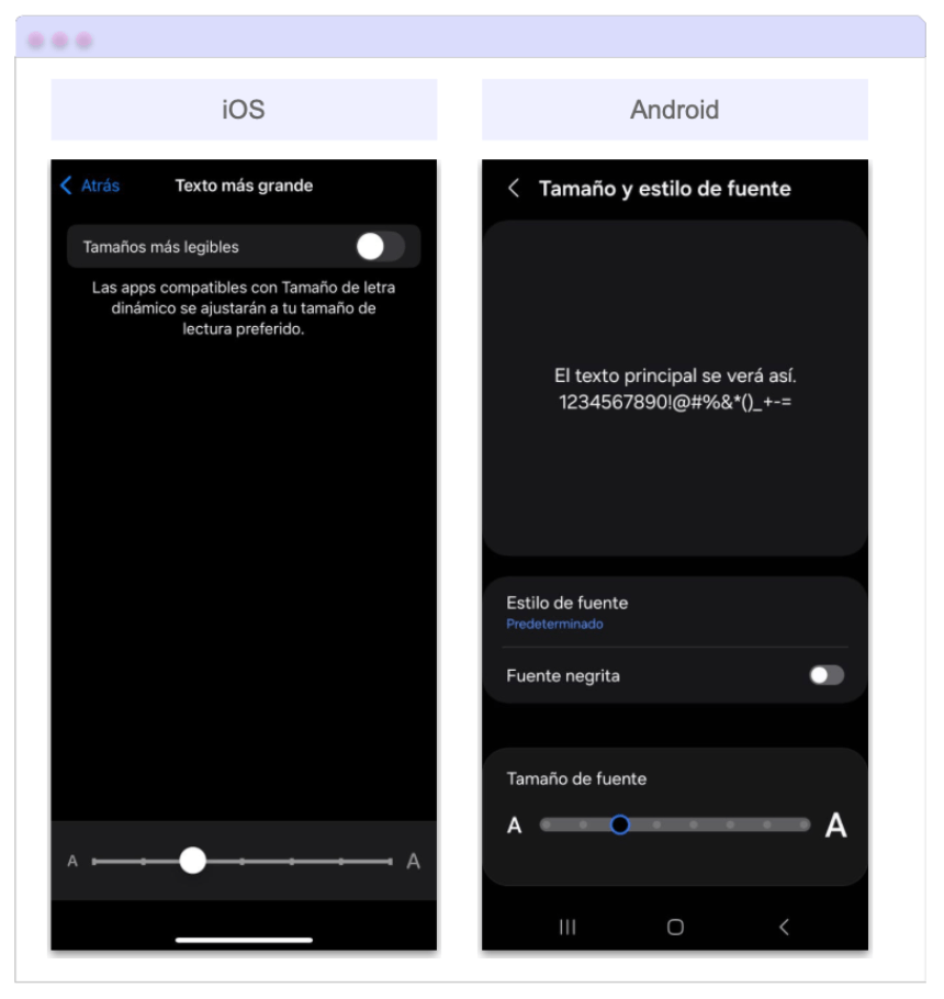
But … How Do I Set Up the Preferences on My Device? 🛠️
To test these settings on your own device, here’s how you can make the text larger or smaller on both iOS and Android.
- 📱 On iOS: Go to Settings → Accessibility → Display & Text Size → Larger Text and adjust the slider to set the text size you prefer.
- On Android: Go to Settings → Display → Font size and style and use the preview slider to adjust the text size.
After following the steps above, you should see a screen similar to the one shown below:
3. CharacterSpacing
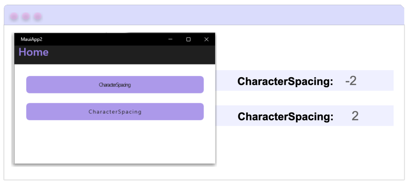
Defines the amount of space between each character of the button’s text and takes a value of type double. This property allows us to play with the visual rhythm of the button. You can either increase or decrease the spacing between characters depending on the style you want to achieve:
- If you want to increase the spacing, use a positive value.
- If you want to create a design or stylistic effect by reducing the spacing, you can use negative values.
Let’s bring it to life inside a button!
<Button
  Text="CLICK HERE"
  CharacterSpacing="5" />
4. CornerRadius
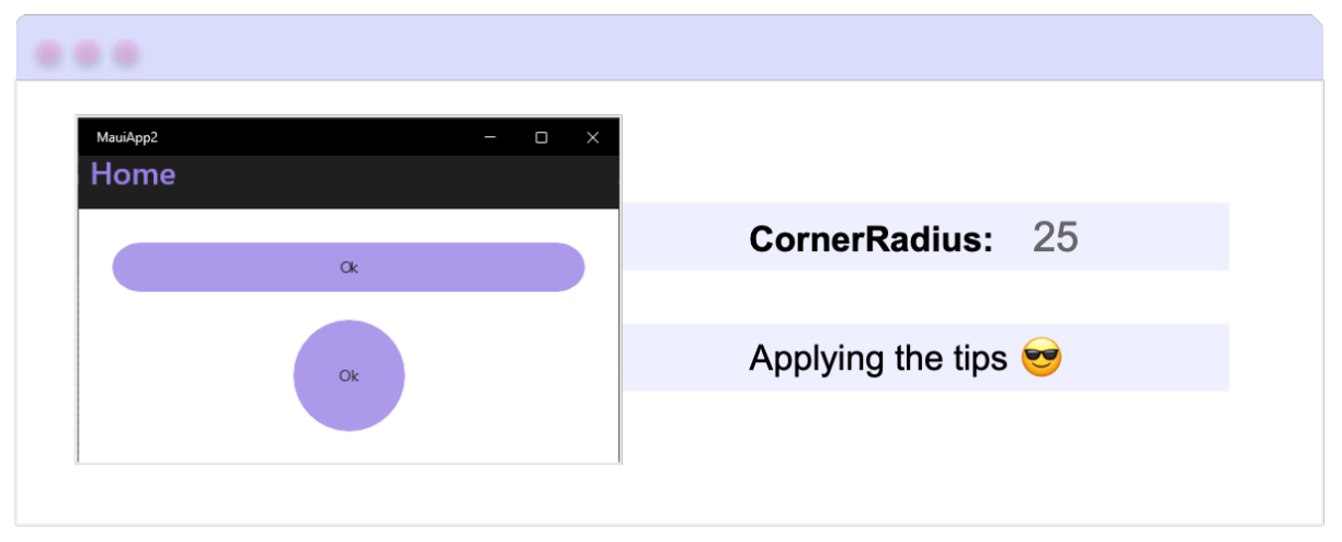
This property lets you define how rounded the corners of your button will be. (It takes a value of type int.) The higher the value, the more rounded the corners will appear, and the lower the value, the sharper they’ll look.
💡 Pro Tip: If you want to create a circular button, simply set the WidthRequest and HeightRequest properties to the same value, and assign the CornerRadius property to half of that value.
For example:
<Button
  WidthRequest="80"
  HeightRequest="80"
  CornerRadius="40" />
5. FontFamily
With this property, you can define the font that your button will use, which helps your button maintain a consistent visual identity with the overall style of your app. By default, it uses Open Sans.
How to use it?
<Button
  Text="Click here"
  FontFamily="MontserratBold" />
6. LineBreakMode
This property is responsible for organizing how the text will be displayed on the button when it spans more than one line. It takes values from the LineBreakMode enum; depending on the value you choose, your text will be displayed in different ways. The values you can use are as follows:
➖ NoWrap: Regardless of the text length, it stays on a single line and only displays the number of characters that fit within the button’s width.
➖ WordWrap: Automatically moves the text to the next line once it reaches the button’s boundaries. Keep in mind that the line break happens after the last full word that can fit; if a word doesn’t fit completely, it is moved to the next line.
➖ CharacterWrap: Automatically moves the text to the next line. This may cause a word to be split if there’s only enough space for a few characters. For example, if the word “Hello” only has space for the first two letters, it will break and place the remaining letters on the next line.
➖ HeadTruncation: Displays the text on a single line and only shows the final part of the text.
➖ MiddleTruncation: Displays the beginning and the end of the text, separated by an ellipsis (…), all within a single line.
➖ TailTruncation: Displays only the beginning of the text and hides the rest.
Let’s use a visual example to better understand how each one behaves:

Let’s make it come alive with a button example!
<Button Text="Hello!! "
  LineBreakMode="TailTruncation" />
✍️ Bonus Information
There’s also another property called ContentLayout, which allows you to control the position of icons within your buttons. If you’d like to learn how to use it, I recommend checking out the article Beyond the Basics: Easy Icon Placement on .NET MAUI Buttons.
Conclusion
And that’s it! 🎉 Now you know several useful properties that can help you customize and enhance your buttons in .NET MAUI—from TextTransform and CharacterSpacing to rounding your buttons and enabling automatic scaling.
I hope this guide helps you discover new ways to make your buttons more dynamic and visually consistent across your apps.
If you have any questions or would like me to dive deeper into other controls or properties, feel free to leave a comment—I’d love to help you! 💚
See you in the next article! 🙋♀️✨
References
The explanation was based on the official documentation: